Sunday, April 28, 2013

The Albany Institute of History and Art

 I also visited the Albany Institute of History and Art. This museum has an eclectic collection of works of local and regional artists, antiquities, and other historical artifacts. Most of the American art is from the 19th century. 

This museum has an urban setting. I got there by walking through Washington Park and down Washington Avenue form my house. I went there from 3 to 5pm on a Friday, so the streets around the museum were quite busy, but the museum itself was not very busy.  


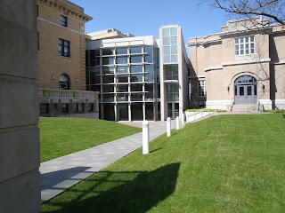
The museum is comprised of two historical buildings and a modern atrium, as can be seen in the two photos that I took to the right. Interestingly, the mix of historic and modern architecture is similar to the Arkell museum, although the specific styles differ somewhat. 

The building to the left, seen in the top picture, holds the museum shop, various meeting rooms, and offices. The building to the right, seen in the bottom picture, holds the art galleries. The glass-walled atrium connects the buildings and includes a stairwell, elevator and welcome desk. 


The historic buildings are made with masonry, while the modern atrium is made with glass and steel. The atrium reflects the International Modern Style, but perhaps with a postmodern uniqueness that adds interest. 


 The interior of the museum reflects the exterior. The atrium is very modern with clean, sleek lines and a certain impersonal sterility. There is certainly an economy of means in this part of the museum. The interior of the historic buildings, however, is somewhat more elaborate and decorative. The contrast between the modern and historic parts of the museum is best exemplified by the stairwells. The stairs in the atrium are in straight lines and made of stone tiles polished to a matte finish. The stairwell in the 19th century sculpture exhibit, however, is a double staircase that frames the room with its curved lines. It is more decorative and suggestive of grandeur than the atrium stairs. Despite these contrasts, the two interior styles are unified by the fact that part of the previous exterior walls of the older buildings are visible inside the atrium. 


I decided to focus on the 19th century sculpture collection, which is displayed on two stories in the historic atrium with curving stairs that is described above. There aren't really specific cues about how to progress through the exhibit because it is a pretty open space. This exhibit displays the institute's collection of sculpture by Erastus Dow Palmer and his assistants Launt Thompson, Charles Calverley, and Richard Park. Erastus Dow Palmer was a local artist. The collection includes busts, full-body sculptures and framed bass reliefs. I thought it would be interesting to focus on work form the same time period and same general region as the paintings that I focused on from the Arkell Museum but in a different medium and form. 


Retrieved from http://www.albanyinstitute.org/details/items/taking-comfort.html

The first piece that I chose to describe is Taking Comfort by Charles Caverley (1879). This is a circular, plaster bass relief depicting a young child sucking his or her thumb. 


Although the only color is white, this piece uses light because shadow is necessary to view the form of the subject. Furthermore, this manipulation of light is done with the actual texture of the piece, or its contours. What is interesting is that the actual texture and the light cause an simulated texture. Specifically, the texture of the hair, cloth and skin are all implied. While the names seems to refer to the fact that the child is sucking his or her thumb, the pure whiteness of the piece amounts to an interpretive use of color to symbolize purity and serenity.  


http://www.albanyinstitute.org/details/items/peace-in-bondage.html

The second piece that I am featuring is Peace in Bondage by Erastus Dow Palmer (1863). This is also a plaster bass-relief. It features an angel who appears to have her hands tied behind her back. It is meant to symbolize the violence during the Civil War (see Albany Institute of History and Art, 2013). 

This piece also uses light because the shadows reveal the form of the angel and tree. This is done with actual texture, or contours, in the plaster. This simulates the texture of skin, hair, the tree, and feathers. 

Interestingly, while the white color of the previous piece evoked a feeling of serenity, this piece has a feeling of tension despite the purity of the white. 


http://www.albanyinstitute.org/details/items/sanford-robinson-gifford.html

The third and final piece that I observed in this gallery is Sanford Robinson Gifford by Launt Thompson (1871). Unlike the others, this one is made of casted bronze, so it is a brownish color, not white. Also, this bust is viewed on all three sides, unlike the bass- reliefs. 

I feel like the brown color gives this sculpture a stately feel. This sculpture uses light to its advantage not with shadow, but with reflection. The reflected light off of the convex contours of the bust lend to the three-dimensional appearance. For example, the detail of the cheekbones is illuminated with these reflections. 

I love the Albany Institute of History and Art, and I like to visit here periodically to see more of the permanent exhibits and the new temporary exhibits. It is a great museum within walking distance form where I live.  
  
References

Albany Institute of History and Art. (2013). Collection details: Peace in Bondage. Retrieved from http://www.albanyinstitute.org/details/items/peace-in-bondage.html

Friday, April 26, 2013

The Arkell Museum at Canajoharie


On April 6th, 2013, I visited the Arkell Museum in Canajoharie, NY with my friend Ally. We made the 50 minute drive from Albany on the NYS thruway. Once off of the thruway, getting to the museum was easy because the town is very small. There are no other art museums nearby. In fact, the streets were essentially deserted. I had never visited this museum before, and its location was somewhat unexpected. The admission was $5 for students. 

The building included two distinct styles together, as can be seen in the photographs that I took. The top image shows the gambrel-roofed library that was built in the 20th century. This part is made with brick. The bottom image shows a 2007 addition by designLAB architects. The addition evokes the industrial past of the area, home of Beech-Nut. Also, this part of the building added 8,000 square feet of gallery space (World Architecture News, 2007). This part is made with stone, steel, glass and white tile. The austere feel of International Modern Style is evident in this part of the museum. Since it was meant to reflect 20th-century industrial buildings, this makes sense. This addition gives the museum a distinctive facade that is noticeable from the thruway. 

The overall organization of the museum is several small galleries, a library, and a great hall. The galleries are organized by theme, and the museum features primarily 19th century American paintings. Also, there is a hallway with displays about the history of Beech-Nut and the Arkell family and a memorial garden. This is mostly on one floor at ground level, but there is a basement level with a classroom and community gallery. 

The overall interior design is modern, but with warm, natural colors that made it inviting. This includes a floor with a map of the area and mural about the area in the great hall. Inside the galleries, however, has a more sterile feel.   

I chose to focus on an exhibit called "Pastoral and Parkland: American Landscape Paintings." I love landscape paintings, especially creative ones that are different than what you might expect. This exhibit is in one of the changing galleries, and it was organized by the museum's staff. The majority of the paintings were described as being "gifts" of the Arkell family. 

This gallery was in a square, medium-sized room with one interior wall that bisected the space. There were also benches in the room and track lighting overhead. The overall feeling was calm and sterile. The paintings were displayed on the walls, at eye level. These walls cued the visitors through the gallery. Furthermore, an introduction of the gallery on one wall marked the "starting place."  Most were in ornate frames, and they all had a plaque with information next to them. This information was helpful for understanding the context in which each painting was created. Specifically, this information outlined the trends of pastoral painting in 19th and 20th century America and its significance in American history. 

Overall, I enjoyed the design of the space, and I felt that the exhibit was explained effectively.

Retrieved from http://www.eriecanal.org/UnionCollege/Wall.html

The first piece of artwork that I chose to describe is New York and the Erie Canal by William Wall (1862). This oil on canvas painting focuses on the river and canal, with some human activity and distant hills also being featured. As the plaque next to the painting described, this is a view from Randall, NY looking toward "The Noses," which is the name of the hills in the background. 

I noticed that this painting has two vanishing points, making it a two-point perspective painting. One vanishing point is the space between the hills in the distance, and another is the far left of the painting. Also, Wall employed atmospheric perspective. The woman and tree in the foreground are more sharply defined than the distant hills. 

The element of light is used in this painting through the implied position of the sun. Due to the dark value of the right side of the clouds and of the hillside to the left, the viewer gets the impression that the sun is shining from the left side of the painting. I feel that this adds "life" to the painting. Also, it gives the painting a happy feeling rather than a dreary feeling.

This painting also had some actual texture, which was unexpected. First, the canvas itself was textured. Also, some paint extended out from the canvas. This made the painting more authentic and dynamic, in my opinion. Although the painting is almost photo-realistic, this actual texture in the paint makes it seem more like a painting. 

The emphasized colors in this painting are blue and green. These local colors underscore the importance of plant life and water in this painting. 

Overall, I liked that this was a peaceful, traditional landscape with some unique elements such as the presence of human activity and the texture of the paint. 

Photo: Come visit us this weekend. The Arkell Museum is open from 1:00 - 5:00 pm on Saturday and Sunday. We are closed on New Years Day and New Years Eve.
Retrieved from https://sphotos-a.xx.fbcdn.net/hphotos-ash3/p480x480/533695_10151323184704207_593903927_n.jpg

The second painting that I selected is Shepherdess and Sheep by Winslow Homer (1878). It is oil on canvas. This painting depicts a young woman and several sheep on a gently sloping hillside. She is wearing a normal working dress and is not depicted in a romanticized fashion. 

This painting has one vanishing point, to the far left of the painting. This means that this painting has a one-point perspective. However, the balance is informal, so it looks different than a basic one-point perspective. An atmospheric perspective is also evident.  

This painting has soft lines that are somewhat impressionistic. This is in contrast to the photo-realistic quality of the previously described painting. 

This painting also features actual texture in the brushstrokes. Again, I feel that this gives the painting an authentic and dynamic quality. 

Repetition of the shape and form of the sheep is an organizing principle of this painting. The repetition of sheep layered behind the young woman brings the emphasis to the young woman, even though she is not in the center. Also, the contrast of the dark dress and the light sheep create this emphasis. 

The most prolific colors in this painting are brown, green and blue. These colors are representative to the natural scene, so they are local colors. The relatively saturated color of this painting is one of the things that appealed to me the most about it. Compared to a lot of the other landscapes, which seemed "washed-out," this painting has a rich representation of color that really "brings it to life" for me. 

This was my favorite painting of the gallery because of the rich colors, the subject matter, the non-romanticized approach and the overall feeling. 

I could not retrieve a photograph of the third painting, but I will describe it. It is an untitled cloudscape by Charles H. Davis with no date specified. The artist, however, lived from 1856 to 1933. Like the other two painting, it is oil on canvas.  

This painting has very bright colors, primarily blue and green. It does not include very much detail, nor is it very representational of actual forms. Therefore, the painting evokes more feeling rather than serving as a depiction of anything specific. The feeling is very dynamic and lively due to the variety of blue and green hues and values. The forms include clouds and farm buildings, but, as mentioned, they are not highly representational, especially the buildings. 

Contrast is very important in this painting because the darker land contrasts with the lighter sky. There is only a little land, so the majority of the painting is sky.       

I really enjoyed my visit to the Arkell museum, and I viewed all of the exhibits in about 2 hours. This is a great example of a private collection of primarily American paintings and it is highly recommended.


References

World Architecture News (2007). designLAB architects is pleased to present the Arkell Museum for the Arkell Hall Foundation.
Retrieved from http://www.worldarchitecturenews.com/index.php?fuseaction=wanappln.projectview&upload_id=1586